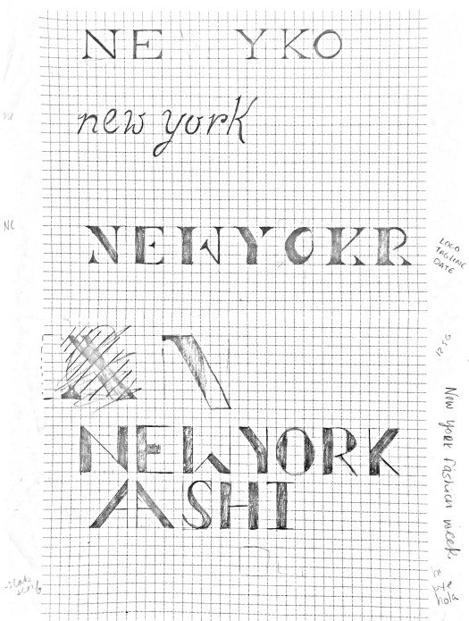
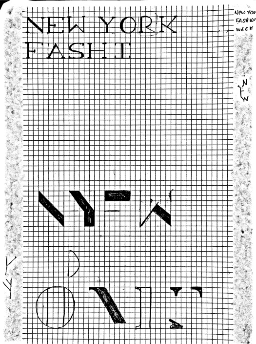
Below is my book with creative process. This was a very interesting project because it allowed me to use all the skills I’ve learned throughout the class. Having to create logotype and typeface from scratch was definitely difficult. Overall, I am happy with my project although Ido believe my typeface can use some improvement.
Project 4: Update
Project 4: Sketches
Below are the start of my sketches. I’m hoping to gain more inspiration and generate a few more concrete ideas.
Project 4: Intro
Project 4 consists of creating a typeface for an event that already exists. I chose New York Fashion Week. I want to try and created a sophisticated yet modern font because New York is typically known for its street fashion. I’m think of monospace font or a serif don’t. I also want to try and create a typeface that has variations of stroke sizes with the letters.
Project 03: Final Product
Final: Project 02
These are the pages for my final booklet for project 02. I tried to make my booklet a little lighter and more colorful than my poster. I brought in a few coding aspect into the book but I didn’t want it be the focus of the book so I tried to display features of the font on the pages as well because I felt as if my poster had a lot of emphasis on the technological uses and aspects of Droid. Overall I pretty happy the outcome of my booklet.
Reflection of Project 02 Critique
I wasn’t fully prepared for the critique because I’ve ben so focused on the poster that I’ve been neglecting my booklet a little. Rather than narrowing down my posters I’ve added a few a more options. I’ve added a few more features to my poster such as ascii art. I’ve also tried to pull a few ideas from my poster to incorporate in my booklet but because I haven’t fully committed to a concept for my poster. I got a few insightful comments for my critique such as changing the font type for my ascii art to mach more with the Droid font. Overall, I think because I haven’t committed to a concept and a vision for my project my peers couldn’t really give me a full critique because my project felt like a work in progress.
Project 02: Droid
The font I chose for project 02 was Droid. My initial poster ideas are vert tech based because Droid was created for the Android phones so it’s a screen based font. I really wanted my audience to see that, so I focused on technology and coding (because it also has a monotype in its type family) because it’s used in a lot of apps as well.
Project 01: Final
This was the final product for Project 01. I ended up choosing Mrs. Eaves as my body font because I thought it it did a great job embodying the romantic nature of the book. I also used Recherche for the title in the front cover for the same reason. with the knowledge I had of the book I though that a script font would help portray the mysterious and passionate essence of the plot.
There were definitely a few challenges through out the project but I also learned a lot. Creating the grid system for the book was difficult but I definitely saw the benefits of it as well. It was a lot easier to keep pages consistent and clean.